

Publishing on Amazon Kindle Direct Publishing (KDP) sounds simple at first—you upload your manuscript and hit publish. But here’s the tricky part: formatting. Many authors quickly realize their book doesn’t look the way they imagined once it’s on a Kindle device or app. Odd spacing, broken chapters, or messy text can ruin the reading experience. That’s why advanced formatting tips matter if you want your eBook to look professional and give readers a smooth journey.
Let’s go step by step into the finer details of making your KDP eBook shine.
Why formatting matters more than you think
Readers judge books not only by their covers but also by how clean and easy they are to read. Imagine opening a book where:
-
Paragraphs don’t line up
-
Images overlap text
-
Table of contents doesn’t work
That’s frustrating, right? 😬 A poorly formatted book can quickly lead to negative reviews—even if the content is amazing. Proper formatting ensures your words look good on every Kindle device, from an old Paperwhite to the Kindle app on a phone.
Use consistent fonts and sizes
One of the most common mistakes new authors make is experimenting too much with fonts. Unlike print books, eBooks have flexible display settings. Readers can change font style, size, and spacing. So, the trick here is not to fight against it.
-
Stick with standard fonts like Times New Roman, Georgia, or Arial during editing.
-
For body text, 11–12 pt usually works well.
-
Avoid fancy fonts because most won’t display properly across Kindle devices.
Think of fonts in eBooks as “suggestions,” not fixed rules, since readers control how they see your book.
Smart paragraph formatting
Here’s where things get a little technical. Many writers use tabs or spaces to indent paragraphs in Word. That’s a recipe for disaster in eBooks. Instead:
-
Use Word’s paragraph settings → first line indent (0.3 to 0.5 inches).
-
Keep consistent spacing before and after paragraphs.
-
Don’t double space lines unless absolutely needed—it looks weird on small Kindle screens.
A clean paragraph structure makes your book flow smoothly, and it prevents the dreaded “text all jammed together” look.
Tables and lists without the mess
Tables and lists often break badly on Kindle if not handled carefully. A large table may look fine on your laptop but totally unreadable on a phone screen.
Here’s a little guide:
| Feature | Do This ✅ | Avoid This ❌ |
|---|---|---|
| Bullet lists | Use standard Word bullets | Custom icons or images |
| Numbered lists | Keep them simple (1, 2, 3…) | Nested or multi-level lists |
| Tables | Keep narrow, simple, few columns | Wide tables with heavy design |
If your book is nonfiction and needs lots of tables, consider redesigning them as simple text-based lists for better readability.
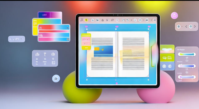
Adding images the right way
Images can make or break your eBook. Whether it’s a chart, a graphic, or just a nice divider, you need to format it correctly.
-
Always insert images “in line with text,” not floating.
-
Compress images to reduce file size (under 5 MB for best KDP performance).
-
Stick to JPEG or PNG formats.
-
Use high resolution (at least 300 dpi) so images don’t appear blurry.
Pro tip: Always preview your eBook on Kindle Previewer before publishing—this tool shows you how images look on different devices.
Creating a clickable table of contents (TOC)
This is one of the most powerful features of eBooks. A clickable TOC lets readers jump directly to chapters. Without it, your book feels unprofessional.
To set this up:
-
In Word, use Heading 1 for chapters, Heading 2 for subheadings.
-
Insert a TOC using Word’s automatic feature.
-
When you upload to KDP, Kindle automatically turns those into clickable links.
Readers love this feature, especially in nonfiction, where they might only want to revisit certain sections.
Use page breaks correctly
Here’s a simple but overlooked rule: every new chapter should start on a new page. Instead of pressing Enter multiple times, insert a proper page break.
In Word: Insert → Break → Page Break.
This avoids messy blank pages or misaligned chapters when converted to Kindle format.
Styling chapter titles
A small design touch can make your book feel more polished. Use larger font sizes for chapter headings (14–16 pt is fine). You can center them, add spacing before/after, or even include small symbols like ★ or ✦ for a creative feel.
But remember: keep it consistent. Don’t make one chapter title bold and another italic—consistency = professionalism.
Hidden gems exist—explore Micro Niches in KDP.
Handling footnotes and endnotes
If you’re writing nonfiction, you might need citations or footnotes. In eBooks, footnotes don’t appear at the bottom of the page like in print. Instead, they become clickable notes.
-
Insert notes using Word’s footnote feature.
-
KDP will automatically convert them into clickable links.
This is especially helpful for academic, research, or reference books.
Avoid overuse of formatting styles
It’s tempting to highlight key sentences with bold, italics, underlines, or colors. But be careful—too much can look cluttered. Kindle devices don’t always support colors the way you expect, and underlines may confuse readers into thinking they’re links.
Stick to bold and italics sparingly for emphasis. Less is more here.
Preview before publishing
Amazon gives you a free tool called Kindle Previewer. This is your best friend. Upload your manuscript there and check how it looks on different screen sizes: tablet, phone, and e-reader.
Things to check in preview:
-
Does the TOC work?
-
Do images resize properly?
-
Are paragraphs clean and aligned?
-
Do chapter breaks appear correctly?
Catching mistakes here saves you from embarrassing reviews later.
Should you use professional formatting software?
Some authors rely on Word, and that’s fine. But if you want extra polish, you can explore tools like:
-
Scrivener (great for writers managing big projects)
-
Vellum (popular for its elegant formatting, Mac only)
-
Atticus (cloud-based alternative to Vellum)
-
Calibre (free, good for file conversions)
These tools give more control over styling and export directly to Kindle-compatible formats.
Common mistakes to avoid
Here’s a quick checklist of what not to do:
-
❌ Using tabs for indents
-
❌ Pasting text directly from websites (brings hidden formatting)
-
❌ Forgetting page breaks for chapters
-
❌ Uploading low-resolution images
-
❌ Ignoring Kindle Previewer
Avoiding these alone can already set your book apart from amateur uploads.
Extra touch: front and back matter
Don’t forget that formatting isn’t only about chapters. The beginning and end of your book also matter.
At the start, include:
-
Title page
-
Copyright page
-
Dedication (optional)
-
Preface or introduction
At the end, include:
-
About the Author page
-
Links to your website or mailing list
-
Call to action (e.g., “If you enjoyed this book, please leave a review”)
These little touches give your book a professional feel and help you connect with readers.
Quick formatting workflow (step-by-step)
Here’s a simple workflow you can follow every time:
-
Write your book in Word (clean text, no fancy styles).
-
Apply consistent paragraph settings and headings.
-
Insert images inline with text.
-
Add a clickable TOC.
-
Insert page breaks for chapters.
-
Export as .docx and upload to KDP.
-
Test in Kindle Previewer.
-
Fix issues, re-upload, and publish.
That’s it! 🚀
FAQs
Q1: Can I use PDF to upload my eBook to KDP?
A: You can, but it’s not recommended. PDFs don’t reflow text well on small screens. Always use Word (.docx) or EPUB.
Q2: Do Kindle devices support color text?
A: Some newer devices and apps do, but older e-readers only show grayscale. Keep your main formatting simple.
Q3: How do I make my images look sharp?
A: Use high resolution (300 dpi), but compress file size so your book doesn’t exceed Amazon’s limits.
Q4: Do I need professional software like Vellum?
A: Not at all. Word is enough if you follow formatting rules. Software just makes the process easier and prettier.
Q5: Can I add clickable links inside my eBook?
A: Yes, you can link to websites, your other books, or even email sign-up pages. Just test them in Previewer before publishing.
Final Thoughts
Formatting might feel boring compared to writing, but trust me—it’s one of the most powerful ways to stand out as an author. Clean, consistent, and professional formatting makes your eBook feel polished and reader-friendly. And the good news? Once you learn these techniques, you can reuse them for every future book.